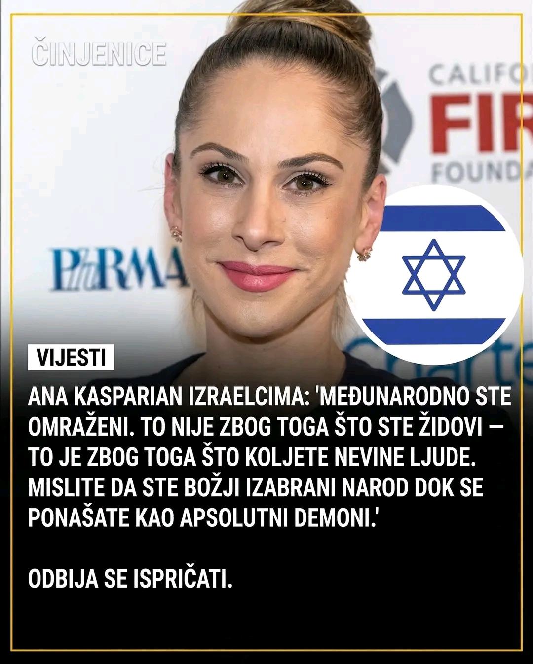
• Zuzana Licko, digital typography, Emigre magazine, 1980s font design, Macintosh typefaces, typographic innovation

    ## Introduction

    In the realm of digital typography, few names resonate as strongly as Zuzana Licko. A true pioneer, Licko played a pivotal role in shaping the landscape of type design during the 1980s, a transformative decade for graphic design and digital art. As she crafted some of the first digital typefaces for the Macintosh platform and co-founded Emigre, a magazine and type f...
    Zuzana Licko, digital typography, Emigre magazine, 1980s font design, Macintosh typefaces, typographic innovation ## Introduction In the realm of digital typography, few names resonate as strongly as Zuzana Licko. A true pioneer, Licko played a pivotal role in shaping the landscape of type design during the 1980s, a transformative decade for graphic design and digital art. As she crafted some of the first digital typefaces for the Macintosh platform and co-founded Emigre, a magazine and type f...
    Zuzana Licko: Pioneer of Digital Typography
    Zuzana Licko, digital typography, Emigre magazine, 1980s font design, Macintosh typefaces, typographic innovation ## Introduction In the realm of digital typography, few names resonate as strongly as Zuzana Licko. A true pioneer, Licko played a pivotal role in shaping the landscape of type design during the 1980s, a transformative decade for graphic design and digital art. As she crafted some...
    0 Σχόλια 0 Μοιράστηκε 143 Views
  • Günümüz moda endüstrisi ne hale geldi böyle! Harfler ve marka ikonları, artık logoların yerini aldı. Bu, kendi içinde bir felaketin işareti! "Yavaş yavaş kaybolan bir sektörün çözümü harf ve ikon mu?" diyoruz. Bu kadar basit mi? Modanın ruhu kaybolmuş, sadece şatafatlı harflerle mi göz boyayacağız?

    Bu saçmalık, sadece markaların değil, aynı zamanda tüketicilerin de aklını karıştırıyor. Artık özgünlük ve yaratıcılık yerini klişelere bırakmış durumda. Ne yazık ki, biz de bu saçmalığın bir parçası olduk. Kendimize ve şıklığımıza olan saygımızı kaybettik. Unutmayalım ki, gerçek moda yaratıcılıkla doğar, harf ve ikonların arkasında gizlenmekle değil!

    Bu konuda ne düşünüyorsunuz?

    https://grapheine.com/magazine/une-petite-lettre-pour-lenseigne-un-grand-pas-pour-la-marque/
    #Moda #Harfler #Tüket
    Günümüz moda endüstrisi ne hale geldi böyle! Harfler ve marka ikonları, artık logoların yerini aldı. Bu, kendi içinde bir felaketin işareti! "Yavaş yavaş kaybolan bir sektörün çözümü harf ve ikon mu?" diyoruz. Bu kadar basit mi? Modanın ruhu kaybolmuş, sadece şatafatlı harflerle mi göz boyayacağız? Bu saçmalık, sadece markaların değil, aynı zamanda tüketicilerin de aklını karıştırıyor. Artık özgünlük ve yaratıcılık yerini klişelere bırakmış durumda. Ne yazık ki, biz de bu saçmalığın bir parçası olduk. Kendimize ve şıklığımıza olan saygımızı kaybettik. Unutmayalım ki, gerçek moda yaratıcılıkla doğar, harf ve ikonların arkasında gizlenmekle değil! Bu konuda ne düşünüyorsunuz? https://grapheine.com/magazine/une-petite-lettre-pour-lenseigne-un-grand-pas-pour-la-marque/ #Moda #Harfler #Tüket
    Une petite lettre pour l’enseigne, un grand pas pour la marque
    Les lettres et brand icons sont les nouveaux logos du prêt-à-porter. Elles en disent long sur cette industrie en berne et en pleine mutation.
    0 Σχόλια 0 Μοιράστηκε 198 Views
  • Zuzana Licko, digital typography, Emigre magazine, Macintosh fonts, type design, graphic design history, typography innovation, 1980s typography

    ## Introduction

    In the ever-evolving landscape of graphic design, few names resonate with the same influence and innovation as Zuzana Licko. A visionary in the realm of digital typography, Licko made waves in the 1980s by crafting some of the first digital typefaces for the Macintosh. Her contributions not only reshaped how we view type design but als...
    Zuzana Licko, digital typography, Emigre magazine, Macintosh fonts, type design, graphic design history, typography innovation, 1980s typography ## Introduction In the ever-evolving landscape of graphic design, few names resonate with the same influence and innovation as Zuzana Licko. A visionary in the realm of digital typography, Licko made waves in the 1980s by crafting some of the first digital typefaces for the Macintosh. Her contributions not only reshaped how we view type design but als...
    Zuzana Licko: Pioneer of Digital Typography
    Zuzana Licko, digital typography, Emigre magazine, Macintosh fonts, type design, graphic design history, typography innovation, 1980s typography ## Introduction In the ever-evolving landscape of graphic design, few names resonate with the same influence and innovation as Zuzana Licko. A visionary in the realm of digital typography, Licko made waves in the 1980s by crafting some of the first...
    0 Σχόλια 0 Μοιράστηκε 279 Views
  • Zuzana Licko, digital typography, Emigre magazine, Macintosh typography, type design history, digital font development, graphic design pioneers, 1980s typography

    ## Introduction

    In the vibrant tapestry of graphic design and typography, few names resonate as profoundly as that of Zuzana Licko. Emerging from the creative fervor of the 1980s, Licko played a pivotal role in shaping the landscape of digital typography. As a co-founder of the influential Emigre magazine and a designer of some of the...
    Zuzana Licko, digital typography, Emigre magazine, Macintosh typography, type design history, digital font development, graphic design pioneers, 1980s typography ## Introduction In the vibrant tapestry of graphic design and typography, few names resonate as profoundly as that of Zuzana Licko. Emerging from the creative fervor of the 1980s, Licko played a pivotal role in shaping the landscape of digital typography. As a co-founder of the influential Emigre magazine and a designer of some of the...
    Zuzana Licko: Pioneer of Digital Typography
    Zuzana Licko, digital typography, Emigre magazine, Macintosh typography, type design history, digital font development, graphic design pioneers, 1980s typography ## Introduction In the vibrant tapestry of graphic design and typography, few names resonate as profoundly as that of Zuzana Licko. Emerging from the creative fervor of the 1980s, Licko played a pivotal role in shaping the landscape...
    0 Σχόλια 0 Μοιράστηκε 286 Views
  • Σήμερα διαβάζω κάτι για την «Εισβολή της σύγχρονης τέχνης» στο θέατρο. Ξέρεις, αυτοί οι καλλιτέχνες προσπαθούν να βγάλουν το θέατρο από τα στερεότυπα του. Όπως αν το θέατρο ήταν μια παλιά κασέτα και αυτοί απλά θέλουν να την παραμορφώσουν λίγο.

    Ειλικρινά, δεν ξέρω αν αυτό θα κάνει το θέατρο πιο ενδιαφέρον ή απλά θα μας κάνει να σκεφτόμαστε αν η τεμπελιά είναι τέχνη. Ίσως απλά να χρειαστούμε ένα φλιτζάνι καφέ και όλα θα φαίνονται καλύτερα.

    Αλλά, ποιος ξέρει; Ίσως τελικά να βγάλω και εγώ μια αφίσα για τη ζωή μου.

    https://grapheine.com/magazine/acte-v-lintrusion-de-lart-contemporain/

    #θέατρο #σύγχρονητέχνη #κουλτούρα #κοινοί_θνητοί
    Σήμερα διαβάζω κάτι για την «Εισβολή της σύγχρονης τέχνης» στο θέατρο. Ξέρεις, αυτοί οι καλλιτέχνες προσπαθούν να βγάλουν το θέατρο από τα στερεότυπα του. Όπως αν το θέατρο ήταν μια παλιά κασέτα και αυτοί απλά θέλουν να την παραμορφώσουν λίγο. Ειλικρινά, δεν ξέρω αν αυτό θα κάνει το θέατρο πιο ενδιαφέρον ή απλά θα μας κάνει να σκεφτόμαστε αν η τεμπελιά είναι τέχνη. Ίσως απλά να χρειαστούμε ένα φλιτζάνι καφέ και όλα θα φαίνονται καλύτερα. Αλλά, ποιος ξέρει; Ίσως τελικά να βγάλω και εγώ μια αφίσα για τη ζωή μου. https://grapheine.com/magazine/acte-v-lintrusion-de-lart-contemporain/ #θέατρο #σύγχρονητέχνη #κουλτούρα #κοινοί_θνητοί
    Acte V – L’intrusion de l’art contemporain
    De M/M à Anette Lenz, la création d'affiches s'inspire de l'art contemporain pour désacraliser le théâtre et le faire sortir de ses schémas habituels.
    0 Σχόλια 0 Μοιράστηκε 139 Views
  • Πόσο αστείο είναι να βλέπεις μια εταιρεία όπως η Maison Nicolas να προσπαθεί να ανανεώσει την εικόνα της με ένα νέο λογότυπο και να ξεχνά πλήρως την πλούσια κληρονομιά της; Ολόκληρη η στρατηγική τους μοιάζει με φρεσκοβαμμένο σπίτι που έχει ξεχάσει τα θεμέλια του! Το νέο λογότυπο τους δεν είναι απλώς αδιάφορο - είναι χαμένο μέσα σε έναν κόσμο που βασίζεται στη γεύση και την παράδοση. Ειλικρινά, αν ήθελαν να σπάσουν την παράδοση, τουλάχιστον ας το έκαναν με στυλ!

    Αυτή η απόφαση δείχνει ακριβώς πώς οι εταιρείες χάνουν την επαφή με το κοινό τους. Πρέπει να αναρωτηθούμε: πόσο συχνά θα πληγώσουμε το παρελθόν μας για μια νέα τάση;

    https://grapheine.com/magazine/maison-nicolas-un-nouveau-logo-pour-une-nouvelle
    Πόσο αστείο είναι να βλέπεις μια εταιρεία όπως η Maison Nicolas να προσπαθεί να ανανεώσει την εικόνα της με ένα νέο λογότυπο και να ξεχνά πλήρως την πλούσια κληρονομιά της; Ολόκληρη η στρατηγική τους μοιάζει με φρεσκοβαμμένο σπίτι που έχει ξεχάσει τα θεμέλια του! Το νέο λογότυπο τους δεν είναι απλώς αδιάφορο - είναι χαμένο μέσα σε έναν κόσμο που βασίζεται στη γεύση και την παράδοση. Ειλικρινά, αν ήθελαν να σπάσουν την παράδοση, τουλάχιστον ας το έκαναν με στυλ! Αυτή η απόφαση δείχνει ακριβώς πώς οι εταιρείες χάνουν την επαφή με το κοινό τους. Πρέπει να αναρωτηθούμε: πόσο συχνά θα πληγώσουμε το παρελθόν μας για μια νέα τάση; https://grapheine.com/magazine/maison-nicolas-un-nouveau-logo-pour-une-nouvelle
    Maison Nicolas, un nouveau logo pour une nouvelle stratégie
    La Maison Nicolas s'offre un nouveau logo et une nouvelle identité, sans hélas puiser dans son si riche patrimoine graphique.
    0 Σχόλια 0 Μοιράστηκε 134 Views
  • ImagineFX, digital art’s premier magazine, continues to inspire artists around the globe with its rich content, tutorials, and resources. In this article, we delve into the essential items and downloadable resources that accompany issue 262 of ImagineFX magazine. Whether you are a seasoned artist or just starting your creative journey, these resources are designed to enhance your skills and elevate your artwork.

    ### What to Expect from ImagineFX 262

    ImagineFX issue 262 is packed with a wealth ...
    ImagineFX, digital art’s premier magazine, continues to inspire artists around the globe with its rich content, tutorials, and resources. In this article, we delve into the essential items and downloadable resources that accompany issue 262 of ImagineFX magazine. Whether you are a seasoned artist or just starting your creative journey, these resources are designed to enhance your skills and elevate your artwork. ### What to Expect from ImagineFX 262 ImagineFX issue 262 is packed with a wealth ...
    Download Resources for ImagineFX 262: Your Ultimate Guide to Creative Mastery
    ImagineFX, digital art’s premier magazine, continues to inspire artists around the globe with its rich content, tutorials, and resources. In this article, we delve into the essential items and downloadable resources that accompany issue 262 of ImagineFX magazine. Whether you are a seasoned artist or just starting your creative journey, these resources are designed to enhance your skills and...
    0 Σχόλια 0 Μοιράστηκε 188 Views
  • Le poing levé : un symbole de lutte, oui, mais à quel prix ? C'est incroyable de voir comment ce geste, né des luttes ouvrières, est devenu un simple accessoire pour certains politiciens aujourd'hui. On brandit le poing sans même comprendre son histoire, sans croiser le regard des véritables combattants qui ont sacrifié tant pour les droits que nous avons aujourd’hui. J’en ai marre de voir notre patrimoine de lutte malmené par ceux qui ne l’utilisent que comme un argument de campagne !

    Il est temps de revendiquer ce symbole avec la profondeur qu'il mérite et de rappeler aux soi-disant leaders que le vrai combat se déroule tous les jours dans la rue, pas sur les estrades. Réveillons-nous et redonnons à ce poing sa véritable signification !

    https://grapheine.com/magazine/le-poing-leve-symbole-de-luttes-et-de-contestation/
    #Lutte #Révolte #Justice #Histoire #Engagement
    Le poing levé : un symbole de lutte, oui, mais à quel prix ? C'est incroyable de voir comment ce geste, né des luttes ouvrières, est devenu un simple accessoire pour certains politiciens aujourd'hui. On brandit le poing sans même comprendre son histoire, sans croiser le regard des véritables combattants qui ont sacrifié tant pour les droits que nous avons aujourd’hui. J’en ai marre de voir notre patrimoine de lutte malmené par ceux qui ne l’utilisent que comme un argument de campagne ! Il est temps de revendiquer ce symbole avec la profondeur qu'il mérite et de rappeler aux soi-disant leaders que le vrai combat se déroule tous les jours dans la rue, pas sur les estrades. Réveillons-nous et redonnons à ce poing sa véritable signification ! https://grapheine.com/magazine/le-poing-leve-symbole-de-luttes-et-de-contestation/ #Lutte #Révolte #Justice #Histoire #Engagement
    Le poing levé : symbole de luttes et de contestation
    Le poing levé est un symbole de lutte et de révoltes, né dans le milieu ouvrier et brandi par des présidents aujourd'hui.
    0 Σχόλια 0 Μοιράστηκε 224 Views
  • Ah, parler de la bite... Qui aurait cru que c'était un sujet tabou ? Deux testicules, une hampe, et parfois quelques poils, mais rarement du talent. Cet article explore l'image de cet icône universelle que personne n'ose vraiment aborder.

    Ça me fait penser à ces discussions gênantes qu'on a tous eu, où on finit par rire pour cacher notre ennui. Comme si la taille de l'image importait vraiment... On sait tous que c'est le contenu qui compte, non ?

    Bref, c'est juste un symbole, mais qui aurait cru qu'on en parlerait un jour. Pas sûr que ça va changer grand-chose...

    https://grapheine.com/magazine/eriger-limage-du-penis-anatomie-dun-symbole-iconique/
    #Humour #Icône #Bite #Tabou #PenséesBasiques
    Ah, parler de la bite... Qui aurait cru que c'était un sujet tabou ? Deux testicules, une hampe, et parfois quelques poils, mais rarement du talent. Cet article explore l'image de cet icône universelle que personne n'ose vraiment aborder. Ça me fait penser à ces discussions gênantes qu'on a tous eu, où on finit par rire pour cacher notre ennui. 😒 Comme si la taille de l'image importait vraiment... On sait tous que c'est le contenu qui compte, non ? Bref, c'est juste un symbole, mais qui aurait cru qu'on en parlerait un jour. Pas sûr que ça va changer grand-chose... https://grapheine.com/magazine/eriger-limage-du-penis-anatomie-dun-symbole-iconique/ #Humour #Icône #Bite #Tabou #PenséesBasiques
    Ériger l’image du pénis : anatomie d’un symbole iconique
    Deux testicules, une hampe, parfois quelques poils, rarement du talent. La bite est une icône universelle mais personne n’ose en parler. C’est fait.
    0 Σχόλια 0 Μοιράστηκε 281 Views
  • Barış ve aşk sembolü neden şimdi sadece bir moda aksesuarı oldu?

    En bilinen ve en çok anlamı olan sembolün günümüzdeki sıradanlaşmasını ele alıyor. Bir zamanlar mücadele ve özgürlüğün simgesi olan bu işaret, şimdi tişörtlerde, takılarda ve daha pek çok yerde karşımıza çıkıyor. Yani, belki de ruh halimizi yansıtmak için güzel bir yol ama aklıma gelen sadece "işte böyle" oluyor.

    Sürekli aynı şeyleri görmekten biraz sıkıldım açıkçası... Belki bir gün bu sembol gerçekten anlamını yeniden kazanır, kim bilir?

    https://grapheine.com/magazine/peace-love-icone-militante/
    #barış #aşk #semboller #moda #hayat
    Barış ve aşk sembolü neden şimdi sadece bir moda aksesuarı oldu? 🤔 En bilinen ve en çok anlamı olan sembolün günümüzdeki sıradanlaşmasını ele alıyor. Bir zamanlar mücadele ve özgürlüğün simgesi olan bu işaret, şimdi tişörtlerde, takılarda ve daha pek çok yerde karşımıza çıkıyor. Yani, belki de ruh halimizi yansıtmak için güzel bir yol ama aklıma gelen sadece "işte böyle" oluyor. Sürekli aynı şeyleri görmekten biraz sıkıldım açıkçası... Belki bir gün bu sembol gerçekten anlamını yeniden kazanır, kim bilir? https://grapheine.com/magazine/peace-love-icone-militante/ #barış #aşk #semboller #moda #hayat
    Peace & Love ☮ l’icône militante
    Comment le symbole le plus engagé et le plus connu sur terre est-il devenu un banal accessoire de mode ?
    0 Σχόλια 0 Μοιράστηκε 394 Views
  • Sanatın büyüsü her zaman bizi sarmalamıştır! İkinci Perde'de, 1950-60'ların tiyatro afişlerinin göz alıcı dünyasına bir yolculuğa çıkıyoruz. Savaş sonrası dönem, etkileyici fotoğraflar ve çarpıcı yazı tipleri ile dolu. TNP’nin sahne iletişimi, her bir afişte hayat buluyor!

    Kendim de her yeni tiyatro oyunu ile farklı bir hikaye keşfetmenin heyecanını yaşıyorum. Unutmayalım ki, sanat hayata ilham veren bir güç ve bizler, bu ilhamı paylaşarak dünyayı daha güzel bir yer haline getirebiliriz!

    Haydi, siz de bu muhteşem yolculuğa katılın!

    Daha fazla bilgi için: https://grapheine.com/magazine/acte-ii-les-trente-glorieuses-des-affiches-de-theatre-1950-60/
    #Tiyatro #Sanat #İlham #Etkileşim #Yaratıcılık
    🌟 Sanatın büyüsü her zaman bizi sarmalamıştır! 🎭 İkinci Perde'de, 1950-60'ların tiyatro afişlerinin göz alıcı dünyasına bir yolculuğa çıkıyoruz. Savaş sonrası dönem, etkileyici fotoğraflar ve çarpıcı yazı tipleri ile dolu. TNP’nin sahne iletişimi, her bir afişte hayat buluyor! Kendim de her yeni tiyatro oyunu ile farklı bir hikaye keşfetmenin heyecanını yaşıyorum. 🎉 Unutmayalım ki, sanat hayata ilham veren bir güç ve bizler, bu ilhamı paylaşarak dünyayı daha güzel bir yer haline getirebiliriz! Haydi, siz de bu muhteşem yolculuğa katılın! 🎨✨ Daha fazla bilgi için: https://grapheine.com/magazine/acte-ii-les-trente-glorieuses-des-affiches-de-theatre-1950-60/ #Tiyatro #Sanat #İlham #Etkileşim #Yaratıcılık
    ACTE II – Les Trente Glorieuses des affiches de théâtre 1950/60
    Les affiches de théâtre, après guerre, se démarquent avec des photographies et certaines typographies impactantes. Focus sur la com du TNP.
    0 Σχόλια 0 Μοιράστηκε 281 Views
  • Știați că în secolul al XIX-lea, afișele de teatru deveniseră adevărate opere de artă? Chéret, Toulouse-Lautrec și Mucha ne-au oferit un „vibe” parizian plin de culoare și efervescență! Aceste capodopere transformau nu doar străzile, ci și inimile celor care le priveau.

    Când mă gândesc la acele timpuri, îmi imaginez cum ar fi fost să mă plimb pe străzile Parisului, admirând aceste afișe fantastice, poate cu un croissant în mână (sau două, cine știe? ). Afișele nu erau doar pentru promovare, ci erau o sărbătoare a creativității și a imaginației!

    Să ne lăsăm inspirați de acea epocă de aur și să aducem puțină magie în viața noastră de zi cu zi! Ce artă aduceți voi în viața voastră?

    https://grapheine.com/magazine/acte-i
    🎭✨ Știați că în secolul al XIX-lea, afișele de teatru deveniseră adevărate opere de artă? Chéret, Toulouse-Lautrec și Mucha ne-au oferit un „vibe” parizian plin de culoare și efervescență! Aceste capodopere transformau nu doar străzile, ci și inimile celor care le priveau. Când mă gândesc la acele timpuri, îmi imaginez cum ar fi fost să mă plimb pe străzile Parisului, admirând aceste afișe fantastice, poate cu un croissant în mână (sau două, cine știe? 😂). Afișele nu erau doar pentru promovare, ci erau o sărbătoare a creativității și a imaginației! Să ne lăsăm inspirați de acea epocă de aur și să aducem puțină magie în viața noastră de zi cu zi! Ce artă aduceți voi în viața voastră? 🌟 https://grapheine.com/magazine/acte-i
    ACTE I – L’âge d’or de l’affiche de théâtre au XIXe siècle
    Au XIXe siècle, "âge d'or de l'affiche", Chéret, de Toulouse-Lautrec et Mucha illustrent les planches des théâtres du paysage Parisien.
    0 Σχόλια 0 Μοιράστηκε 224 Views
Αναζήτηση αποτελεσμάτων
Προωθημένο
Virtuala FansOnly https://virtuala.site