Behind the scenes on bizarre anime adaptation DAN DA DAN
(Image credit: YT/S.D. Courtesy of GKIDS)
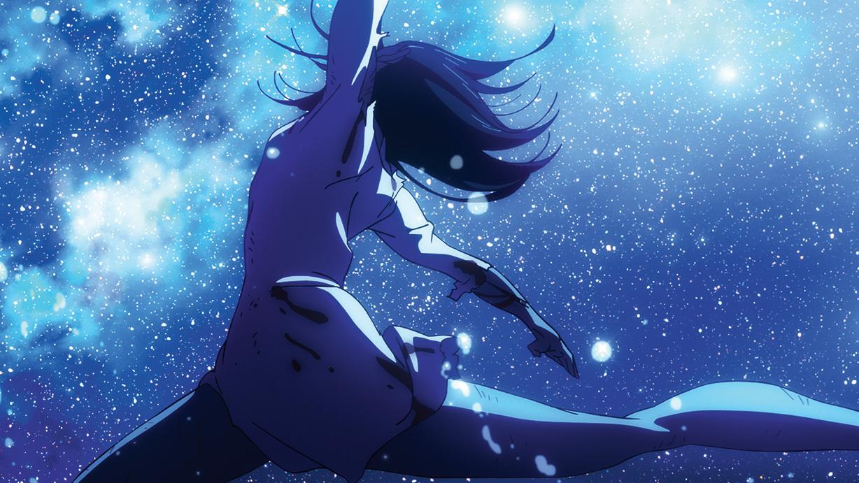
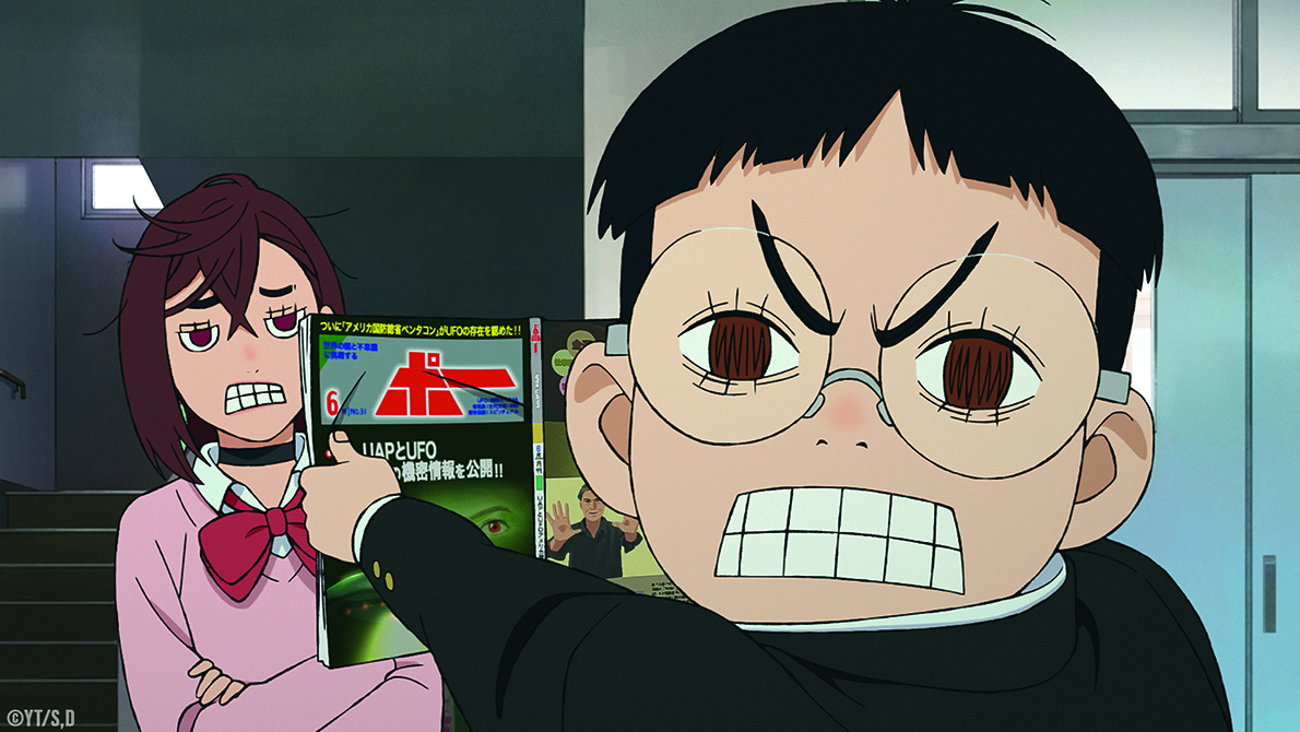
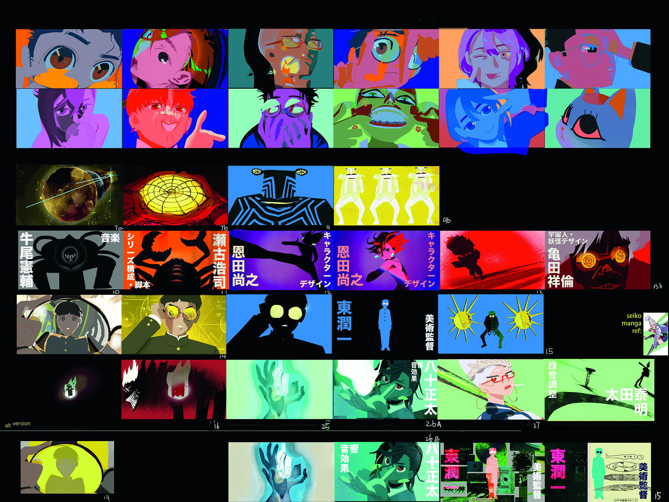
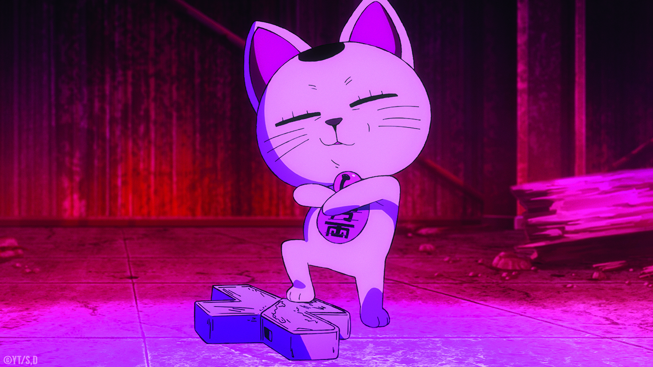
One of the essential elements of visual storytelling is the colour palette, which plays a role in setting the tone, establishing or supporting themes, and directing the viewer’s attention by highlighting and de-emphasising objects depending on their importance within the frame.
Going into vibrancy overdrive is the anime adaptation of Yukinobu Tatsu’s manga DAN DA DAN, now streaming on Crunchyroll and Netflix, distributed by GKIDS, directed by Fuga Yamashiro, and animated by Science SARU.
Daily design news, reviews, how-tos and more, as picked by the editors.
(Image credit: YT/S.D. Courtesy of GKIDS)
(Image credit: YT/S.D. Courtesy of GKIDS)
(Image credit: YT/S.D. Courtesy of GKIDS)
Thank you for reading 5 articles this month* Join now for unlimited access
Enjoy your first month for just £1 / $1 / €1
*Read 5 free articles per month without a subscription
Join now for unlimited access
Try first month for just £1 / $1 / €1
Trevor Hogg is a freelance video editor and journalist, who has written for a number of titles including 3D World, VFX Voice, Animation Magazine and British Cinematographer. An expert in visual effects, he regularly goes behind the scenes of the latest Hollywood blockbusters to reveal how they are put together.