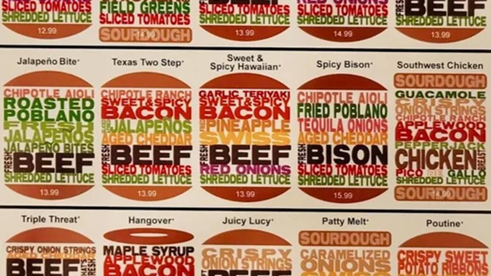
A clever use of colour and typography can communicate so much in graphic design. Alas, like even the finest-quality grass-fed beef from the Argentine pampas, it can be overdone and overseasoned.
This menu design from a small local burger restaurant is giving infographic and festival lineup vibes for me, but graphic designers have serious beef with its legibility. Perhaps a word cloud sandwich doesn't makes for the best user experience when it comes to ordering a burger?
Daily design news, reviews, how-tos and more, as picked by the editors.

Thank you for reading 5 articles this month* Join now for unlimited access
Enjoy your first month for just £1 / $1 / €1
*Read 5 free articles per month without a subscription
Joe is a regular freelance journalist and editor at Creative Bloq. He writes news, features and buying guides and keeps track of the best equipment and software for creatives, from video editing programs to monitors and accessories. A veteran news writer and photographer, he now works as a project manager at the London and Buenos Aires-based design, production and branding agency Hermana Creatives. There he manages a team of designers, photographers and video editors who specialise in producing visual content and design assets for the hospitality sector. He also dances Argentine tango.